Usage
Add a Kanban view to a Base
- Open a Base (or create one).
- Add a new view and choose Kanban from the view-type picker.
- The Base’s filters decide which notes appear, and each note becomes a card.
You can add several Kanban views to the same Base. Each one is independent.
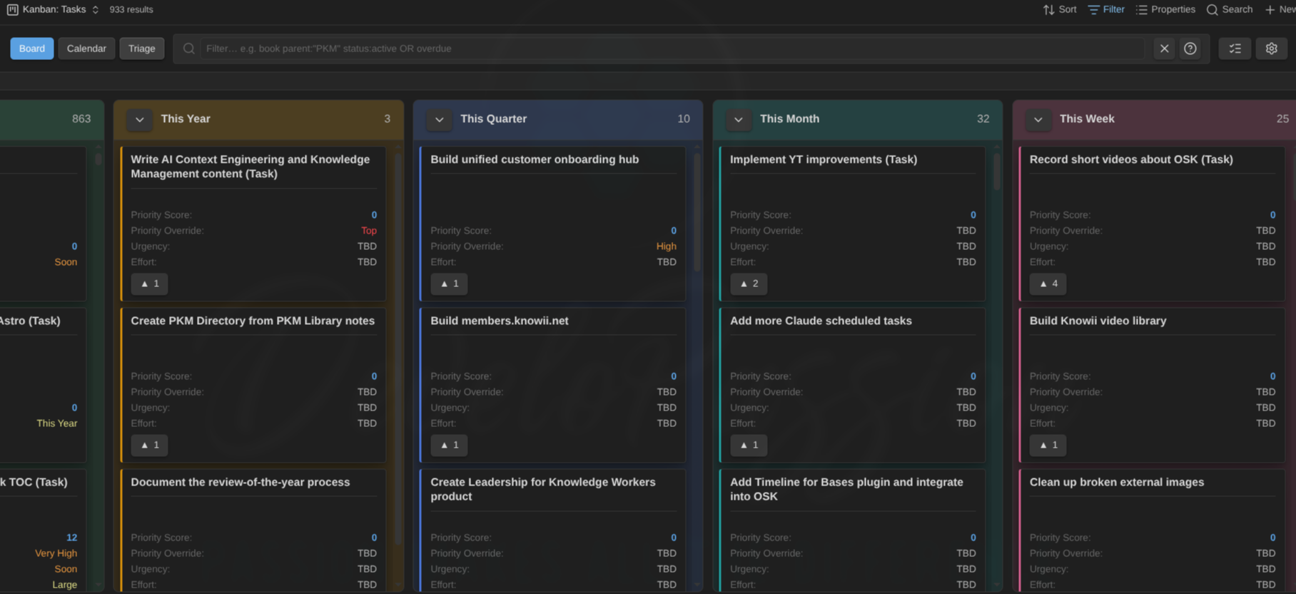
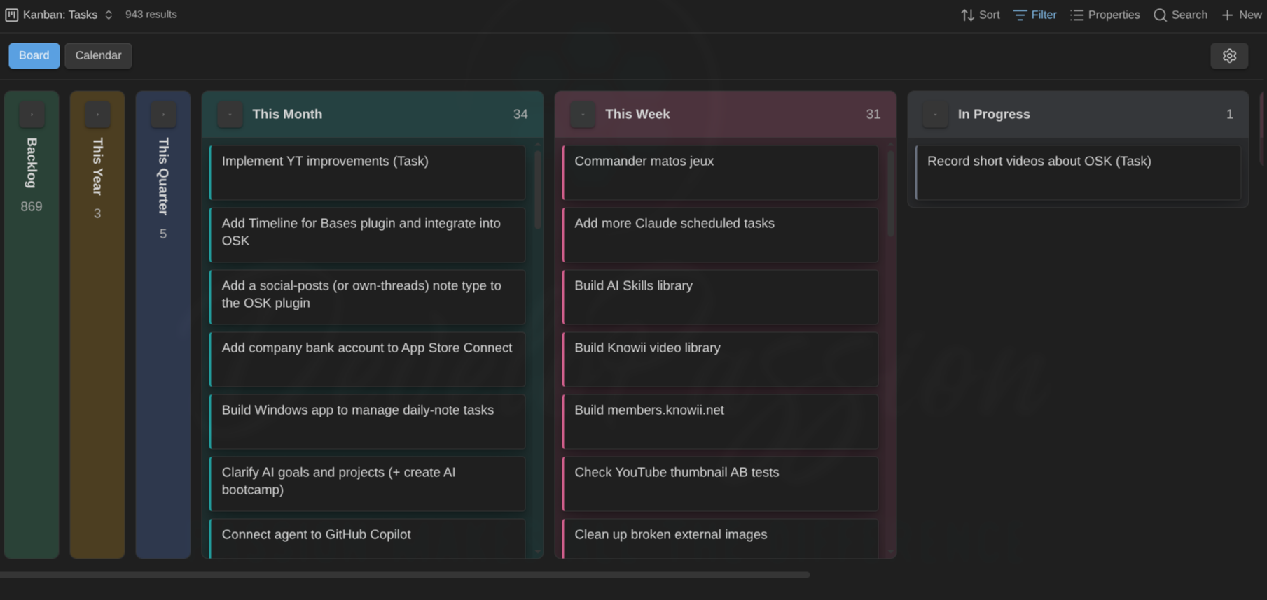
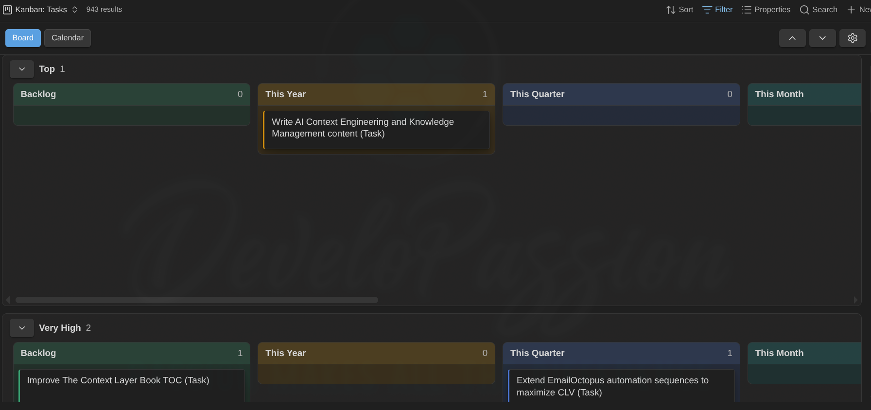
The same idea scales to a large base. Collapse the columns you don’t need right now to keep the backlog out of the way:
Columns from status
Cards are placed by a status property. The plugin looks for a property named status first, then any property whose name contains status, and you can override it per view.
The columns themselves are defined explicitly. They are not guessed from the values in your notes, so a typo never creates a stray column. A board takes its columns, in order of preference, from:
- the Statuses (columns) list in the view settings, or
- the note type’s allowed status values from the Obsidian Starter Kit (if installed), or
- the Default statuses list in the plugin settings.
If none are defined, every card sits in the Unmapped column. That’s the starting point until you define your statuses.
- Values can carry a numeric prefix to control order.
10 Todo,20 Doing,30 Doneshow in that order, and the number is hidden on the column header. - Notes whose status isn’t one of the defined columns gather in Unmapped (shown first by default, hidden when empty).
- Collapse a column with the chevron in its header. It shrinks to a slim labelled bar so you can focus on the rest. Collapsing applies to that status across every swimlane. Click the chevron again to expand.
Moving and reordering cards
- Drag a card to another column to change its status (the status property is rewritten).
- Drag a card within a column to reorder it. The new position is saved to a
manual_orderproperty on the note. - Right-click a card → Send to top / Send to bottom to jump it to either end of its column without dragging.
- Drag a card to the Unmapped column to clear its status.
- Drag a column header left or right to reorder the columns. The new order is saved to this board (the per-view status list) and takes precedence over the default order. The Unmapped column stays put (its side is set by the Unmapped column position option).
Manual ordering is stored in your notes, not in plugin data, so it travels with the vault.
Auto-sort a column by a property. Instead of hand-curated manual order, a board can sort the cards inside every column by name or by any property (priority, due date, created, and so on), ascending or descending. Set Card sort, Card sort property, and Card sort direction in Configure view → Columns. Missing values sort last. While a non-manual sort is active, dragging a card within a column (plus the keyboard reorder and the menu’s Send to top/bottom) is turned off, since sorting owns the order, but you can still drag between columns to change status. Switch Card sort back to Manual order to restore your saved manual_order and re-enable reordering.
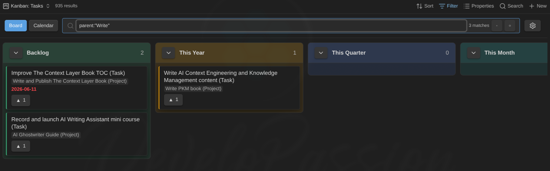
Filtering (search bar)
The filter box in the toolbar (right after the Board / Calendar buttons) narrows the visible cards as you type, in both board and calendar mode. It supports a compact, Jira-like query language. The count of matches shows next to the box, and the × (or Esc) clears it. Your filter is saved with the view, so it persists when you reopen the board. Click the ? for an in-app cheat-sheet.
Basics
- Words = AND.
book projectmatches cards containing both. OR(or|) between groups.book OR plan. AND binds tighter than OR, sobook project OR goalmeans(book AND project) OR goal.-orNOTexcludes.project -status:done.- A plain word searches the title, related note names, tags, and every frontmatter property value (not the note body).
property:value qualifiers
- Quote values with spaces:
parent:"PKM Library". - Comma = OR within one property:
status:active,done. - Recognized names:
title,status(matches the value or its column label),parent,ancestor(any transitive parent — the parent, its parent, and so on),child,sibling,blocked,tag,due, or any frontmatter property (e.g.urgency:now,effort:large), even properties not shown on the card. :matches substrings;:=matches the whole value.parent:appmatches children of bothAppandApp Backend;parent:="App"matches onlyApp(still case-insensitive). Works for every qualifier (status:=done,tag:=work, …).
due: dates
- Keywords:
due:today,due:overdue,due:none, anddue:week/due:month/due:quarter/due:year(the calendar period containing today). - Comparisons:
due:>2026-01-01,due:<2026-01-01,due:>=…,due:<=…, or an exact daydue:2026-01-15.
Example: book parent:"PKM" status:active OR due:overdue.
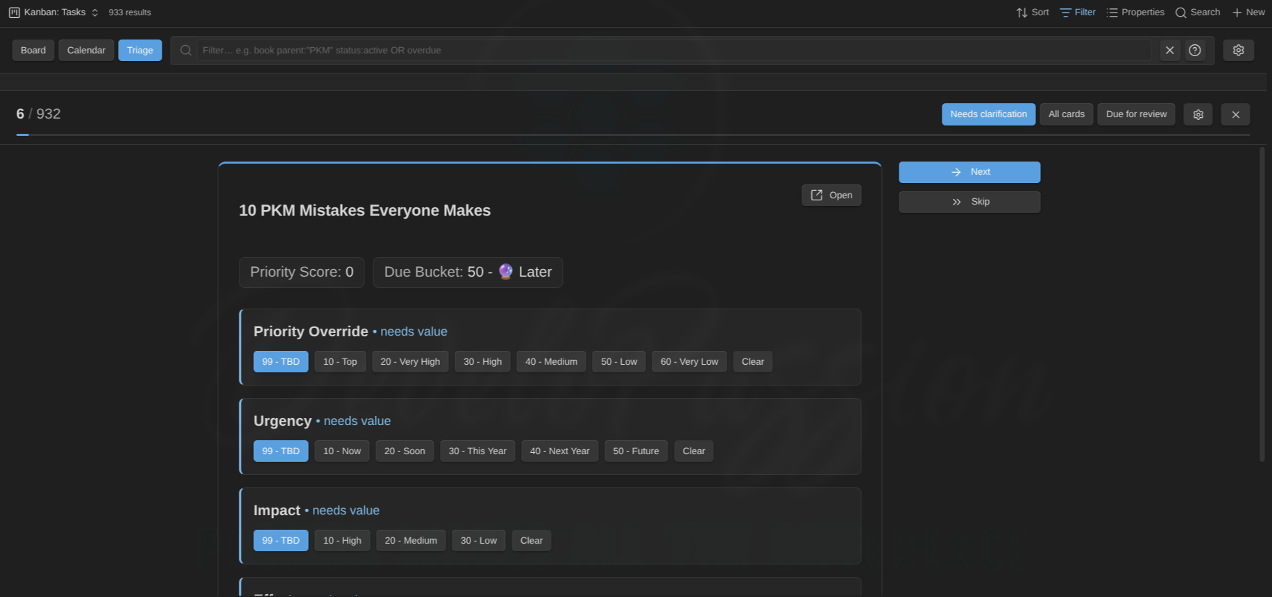
Triage mode
When a backlog feels overwhelming, Triage mode replaces the board with a focused, one-card-at-a-time queue, so you clarify items in short passes instead of facing the whole wall at once. Switch to it with the Triage button next to Board / Calendar (or the Toggle triage mode command).
The card scrolls on its own when it’s tall (or the UI is zoomed), and the scope tabs and the Skip / Next actions stay pinned so they’re always reachable.
A queue pane on the left lists every card in the current scope, grouped by note type then status (the type level only appears on multi-type boards). Click any card to jump straight to it on the right — the current one is highlighted, and a card that no longer needs triage in this scope is muted. Collapse a group with its header, or the whole pane with the « toggle (remembered per view). It’s the same panel used by the calendar and timeline.
Each card shows:
- The note title at the top, with an Open button beside it to jump to the note.
- Read-only context below it: the properties you chose to see, including base formulas (e.g. a
priority_scoreor a horizon formula), so you decide with the computed values in view. - One-click editable controls: each editable enum property (priority, urgency, effort, and so on) as a row of its allowed values, click one to set it. The selected value is highlighted, a property that’s been handled (a real value, no longer needing triage) gets a ✓ check by its name so you can see at a glance what’s left, and properties that still need a value are flagged • needs value. (Allowed values come from the Enums config / Starter Kit, see Card content → enums.)
- Skip / Next to move through the queue, with a remaining count. Both scroll the card back to the top so the next one starts at its title. While a card still has values left to set, picking one stays put (the view re-renders in place, keeping your scroll) so you can see the recomputed score; the moment you fill the last one, triage jumps straight to the next card.
When a card’s triage is completed (its last gating property filled, or a review marked done), a short confetti burst celebrates it before advancing. Turn this off with Celebrate completed triage in Settings → Community plugins → Kanban Action Planner (under Review (triage)). Once the whole queue is sorted, an “All done! 🎉” message takes over.
Three scopes, switched in the header (the active one is highlighted):
- Needs clarification: only cards with an unset gating property. A card leaves the queue once it’s complete. A property counts as unset when it’s empty or absent, matches one of your needs-triage values (e.g.
TBD,No Target), or, when its allowed values are known, holds a value that isn’t one of them (stale or invalid). - All cards: every card, worst-first (most unset properties first), for a re-prioritization pass even when nothing is strictly missing.
- Due for review: cards whose review is overdue, most-overdue first (see Reviews below). Here the action button is Reviewed, which stamps the review fields and advances.
Configure triage with the gear in the triage header (or the Configure triage command), which opens a dialog with proper property pickers. Type to search, click to add, and each selection shows as a removable chip:
- Editable properties: the enum props triage lets you set, picked from your note types’ properties (the Starter Kit definitions, or the properties you’ve given allowed values).
- Gating properties: what decides “unclarified”. Leave empty to use the editable set.
- Context properties: read-only info to show. Here you can also pick the base’s formulas (e.g.
priority_score). Leave empty to use the view’s displayed properties. - Needs-triage values: values that count as unset (e.g.
TBD), added as free-text chips. - Scope: the default scope (also switchable live in the header).
Everything is saved per view (in the .base), so each board has its own triage setup. (The Triage scope also appears in the standard Configure view panel for quick access.)
On a mixed-type board (e.g. an “All actions” board of goals + plans + projects + tasks) triage and review keep working, resolving each card against its own note type:
- Editable controls and their values come from the card’s type. A control only appears for a card whose type defines that property.
- Gating is type-aware: a gating property only flags a card when that card’s type actually defines it. So a task-only property (e.g.
time_estimate) never marks goals/plans/projects as needing a value, and vice-versa. (This is why a board of shared planning properties like priority/urgency/effort triages cleanly across every type.) - Review uses the global review properties, so it’s the same on every card regardless of type.
Reviews (spaced repetition)
The Due for review triage scope turns the queue into a periodic review ritual, so the backlog never silently rots. It uses three note properties:
- last reviewed (a date): when you last reviewed the note,
- review interval (a number of days): how often it should be reviewed,
- review count (a number): how many times it’s been reviewed.
A card is due when last reviewed + review interval is on or before today, or when it was never reviewed (which sorts first). The queue is ordered most-overdue first, and each card shows its review status (last reviewed, count, how overdue) on top. Clicking Reviewed sets last reviewed = today and increments review count, then advances, so the card drops out until it’s next due. You can still adjust the enum values while reviewing.
The property names are configurable in Settings → Community plugins → Kanban Action Planner under Review (triage). They default to last_reviewed, review_interval, and review_count. A Default review interval (days) (default 30) is used for notes that don’t set their own interval. Review works on any Kanban view via the scope switch, with no per-view setup needed.
Swimlanes (grouping)
Split the board into horizontal lanes, each with its own columns. Choose how to group in the note type’s Swimlanes section (Settings → Note types), or override it per view (see View options):
- None: a single plain board.
- By note type: one lane per note type (recognized via the Obsidian Starter Kit or your own local recognition rules).
- By property: one lane per distinct value of a property you choose (e.g. a
projectorarea). Lanes order by a numeric prefix just like columns (10 Alpha,20 Beta).
Mixed boards group by note type automatically. When a Base’s results contain more than one recognized note type (e.g. an “All actions” view with goals, projects, and tasks) and you haven’t chosen a grouping, the board auto-groups by note type — each type gets its own lane with its own columns (see below). Set the per-view Swimlanes option to None to keep a flat board instead.
Mixed note types on one board
Different note types often have different status vocabularies (a task’s Backlog → Done vs a project’s Idea → Abandoned). On a mixed board:
- Each note-type lane shows its own type’s columns, colors, and WIP limits — a project card sits in Active in the Projects lane while tasks flow through their own columns below.
- A card’s own note type is authoritative for its status. Dragging, the card menu’s Set status, and keyboard moves only ever offer/write values from the card’s own type — a project can’t be given a task status.
- Bulk set status (multi-select) works when the selection is a single type; a mixed selection shows a notice instead (Archive / Open / Clear still work).
- Column drag-reorder is off on mixed boards (order comes from each note type’s definition); it still works on single-type boards. Setting an explicit per-view Statuses (columns) list reverts the whole board to one shared column set, for when you want to mix types in the same columns on purpose.
Cards with no value for the grouping property collect in an Ungrouped lane, which is hidden when empty. Each lane header has a chevron toggle to collapse it, plus its card count.
Each lane is as tall as it needs to be, up to one screen. A lane with a few cards stays short, while a full lane stops at the screen height and its columns scroll inside it (so the lanes don’t push each other off-screen). When there’s more than one lane, up and down buttons appear next to the gear to jump to the previous or next lane.
- Drag a card to another lane to reassign it. For property grouping, the grouping property is rewritten to the target lane’s value (or cleared when dropping into Ungrouped). You can cross lanes and columns in one drag, updating both the lane property and the status.
- Note-type lanes can’t be reassigned by dragging (a note’s type comes from its tags or folder), so a cross-lane drop there is ignored. Moving within the lane still works.
On small screens lanes stack and collapse, so you can focus on one lane at a time.
Relationships
Cards can show how notes relate. The plugin reads link-properties (frontmatter holding wikilinks) for four roles, parent, sibling, child, and blocked by, and detects the inverse automatically (if A lists B as a child, B shows A as a parent; siblings are mutual). Configure which property feeds each role in the note type’s Relationships section (Settings → Note types). You can also detect children by tag: a note carrying one of the chosen tags that links back to a card is treated as its child.
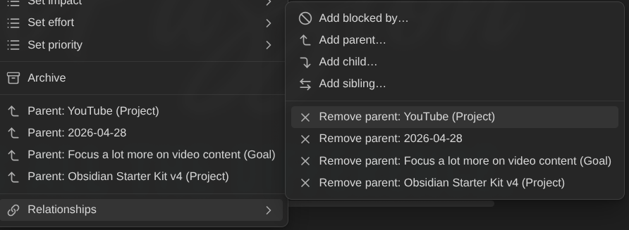
On each card:
- A small badge row shows one counted badge per role (▲ parents, ▼ children, ↔ siblings), so a note with three children shows ▼ 3, and hovering lists the names. Click a badge to open the related note. When there are several, you get a menu to pick one. Ctrl/Cmd-click (on the badge or a menu item) opens in a new tab. The ▼ children and ▲ parents badges always open a menu — on top of it, Focus on children on this board (▼) / Focus on children of X (▲) zoom the board (see Focus on a card’s children).
- A note with a non-empty blocked by gets a red ⛔ badge (counted the same way, ⛔ 2 when blocked by two) and a red edge. Click it to jump to the blocker, or pick from the menu when there are several (Ctrl/Cmd-click for a new tab). Blocking never changes a card’s status automatically.
- The card’s right-click menu also lists related notes to open.
- Edit relationships from the board. The right-click menu’s Relationships submenu lets you Add a parent/sibling/child/blocked-by (pick a note from the fuzzy list) or Remove one. This writes the link to the note’s frontmatter property for that role, so it shows up everywhere, and the blocked badge and filter update live. You can only add a role that has a property configured (a role set to None has nowhere to store the link), and you can only remove links stored on this note (a relationship the plugin infers, e.g. a child shown because the other note names this one as its parent, is edited from that other note).
Blockers can live on another board, and archiving a blocker clears it. A blocker counts wherever it lives: a task blocked by a project stays blocked even though the project sits on a different board. A blocker stops counting only when it’s archived (moved into a note type’s archive folder): the ⛔ count drops, and the card unblocks once its last non-archived blocker is gone. (Parent/sibling/child badges aren’t affected by archiving.) Edits apply live: change or remove a blocked by link, or archive a blocker, and the board updates without a reload.
Use the Blocked cards view option to show all, show only blocked, or hide blocked cards.
Focus on a card’s children (zoom)
Zoom into a card that has children: the board re-filters to show only the notes whose parent is that card, laid out in the usual status columns. Focus a project and you see just its tasks; focus an area and you see its projects.
Three ways to trigger it:
- The card’s right-click menu → Focus on children (shown only when the card has children).
- The ▼ children badge menu → Focus on children on this board (top item).
- From a child, going up: the ▲ parents badge menu → Focus on children of X. On a mixed board (e.g. an “All actions” view), click a task’s ▲ badge and focus its project to see all of that project’s children — the task itself and its siblings — in one move.
Each entry point also offers Focus on all descendants: instead of the direct children only, the board shows the whole subtree — children, grandchildren, and so on. Focus all descendants of a goal and you see its projects and their tasks at once. Under the hood this writes an ancestor:="Title" term (a card matches when the focused note is any of its transitive parents); the chain is climbed through the notes on the board, so a hierarchy that passes through a note the Base excludes stops there.
Under the hood, zooming simply writes a parent:="Card Title" (children) or ancestor:="Card Title" (descendants) term into the filter box — there is no separate mode. That means:
- It ANDs with whatever you already typed (e.g.
status:activestays applied). - Zooming again drills down or re-scopes: the next focus swaps the zoom term (a children zoom replaces a descendants zoom and vice versa), one focus at a time. To go back up, dismiss the chip and focus another card (or edit the query directly).
- It persists with the view, like any filter, across close/reopen.
While focused, a chip (▼ Website Redesign ✕) shows next to the filter box:
- Click the ✕ to remove only the zoom term — the rest of your query survives.
- Click the label to open the focused parent note.
Focus on children matches direct children only (the same parent/child links the ▼ badge counts, including inferred ones); Focus on all descendants matches the whole subtree. The focused card itself is not shown — the chip is the context.
Heads-up: zoom filters within the notes this view’s Base already selects. If the Base’s own filters exclude the children (e.g. you focus a project on a projects-only view, and its children are tasks), the board comes up empty — use a view whose Base includes the children, like a mixed “All actions” view.
Archiving
When you’re done with a card, you can archive its note: move it out of the board into a dedicated folder while keeping all links intact.
Archiving is per note type. Each note type has its own archive folder, set in its Archiving section under Settings → Note types. So on a board mixing e.g. Tasks and Projects, each card is archived to the folder that belongs to its type (Archive/Tasks/ vs Archive/Projects/). A card whose type has no folder set simply can’t be archived (the menu item is hidden).
Set this up in each type’s Archiving section:
- Archive folder: where archived notes go. Start typing and existing folders autocomplete, and any
placeholder you've added is kept. The path supports placeholders that resolve at archive time:,,,,,,, ``. For example,Archive/files intoArchive/2026. Leave it blank to disable archiving. Intermediate folders are created automatically, and a name clash is resolved with a numeric suffix (Task 1.md) so nothing is ever overwritten. - Auto-archive on status: optional and off by default. Tick one or more statuses and a card is archived automatically the moment it transitions into any of them (by drag or menu). Reordering a card that’s already in such a status does nothing. Only the transition triggers it.
To archive manually, right-click a card → Archive (only shown when an archive folder is set). If the note still has active children or blockers you get a non-blocking heads-up: the move proceeds and the wikilinks are preserved. Archived notes leave the board because they no longer match the Base’s filter.
Calendar mode
Turn the board into a scheduling calendar. Use the Board / Calendar switch at the top-left of the view to flip between the two modes (it persists per view). The view splits into a left Scheduling panel and a calendar on the right.
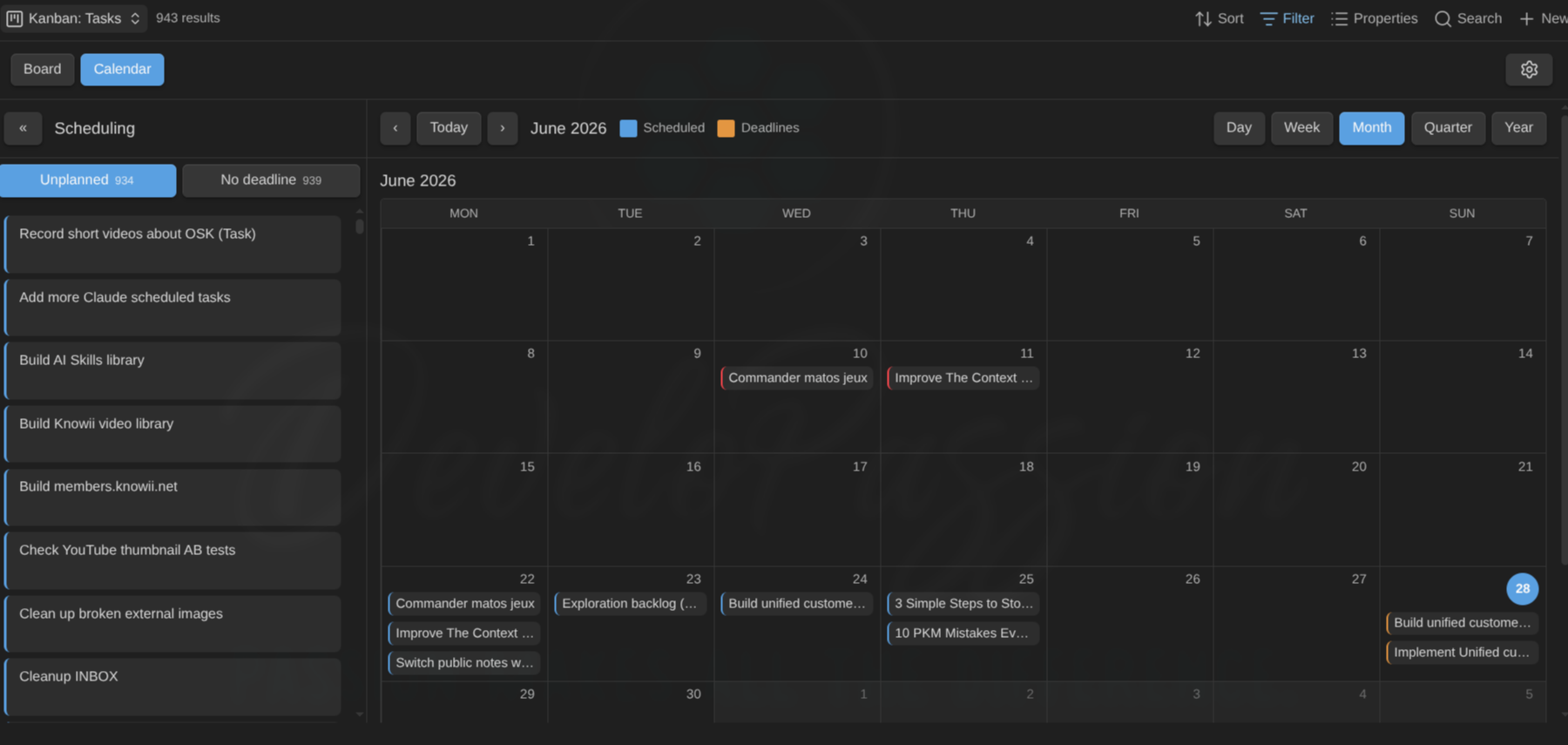
The calendar shows both dimensions at once. Every card is plotted on both its scheduled date (date_scheduled by default) and its deadline (date_due), so you can see what’s planned and what’s due in one view. Chips are color-coded by their left edge:
- Blue: a scheduled date (when you plan to work on it).
- Orange: a deadline.
- Split blue/orange: both fall on the same day.
- Red: an overdue deadline (its day is already in the past).
- Dimmed, dashed edge: the continuation of a multi-day span — a card with a scheduled date and an estimate appears on every day it covers (hover shows
day 2 of 5). Only the first day’s chip is draggable; moving it moves the whole span.
A card with a scheduled date and a deadline therefore appears twice, once on each day, so a task planned for Monday and due Friday shows up on both. Use the legend in the calendar toolbar (◼ Scheduled ◼ Deadlines) as a filter: click either swatch to hide or show that dimension (both on by default).
The panel’s two tabs are backlogs (cards still missing a date), and they decide which date a panel drag sets:
- Unplanned: cards with no scheduled date.
- No deadline: cards with no deadline.
Each tab count is the size of that backlog. Within a tab, the cards are grouped by note type, then by status — the type level shows as full-width tab-style headers on multi-type boards (single-type boards skip it), and all groups start collapsed (click a header to expand). Collapse the panel itself with the « toggle (the “Scheduling” title stays visible, turned vertical). When the calendar gets too narrow, for example in a split pane, the panel collapses automatically and re-opens when there’s room again. Your own manual collapse or expand always takes precedence.
The calendar toolbar switches range (Day, Week, Month, Quarter, Year) and navigates with ‹ / › / Today. Quarter and year show compact month grids with a per-day count. Click any card to open its note. Weeks start on the day set by First day of the week in the plugin settings (default Monday).
Day view and zoom into a day: click Day in the range switcher to open today as a focused single-day view, or click any day number (or empty cell space) to zoom into that specific day. Grid days show a pointer (hand) cursor to signal they’re clickable. The day view lists all of that day’s cards and has its own ‹ / Today / › day navigation (plus ‹ Back to return to the previous range). This is especially handy from Quarter or Year, where days only show a count: click one to see what’s on it. You can still drag a card from the panel onto the focused day to schedule it, or drag one out to the panel to clear its date.
Schedule by dragging:
- Drag a chip on the calendar onto another day to move its own date. A blue chip reschedules, an orange chip moves the deadline, a split chip moves both together (written in your configured date format,
YYYY-MM-DDby default). - Drag a card from the panel onto a day to set the date for the active backlog tab (Unplanned → scheduled date, No deadline → deadline).
- Drag a chip back onto the panel to clear the date it represents.
Schedule from the right-click menu (any card, board or calendar). Right-click a card for Schedule for today / tomorrow / on a date… / Clear scheduled date and the same for Set deadline. “On a date…” opens a small date picker. This is the quickest way to set or change a date without dragging, and it works on the board too, not just the calendar.
Sort the panel (view options): order the cards by Manual order, Name, or a property (e.g. a priority or estimate). To narrow the panel, use the toolbar filter box. It applies to the calendar and its panel together.
Timeline mode
Where the calendar answers “what happens on day X”, the Timeline shows how the work spreads and overlaps over time: one row per card on a shared axis, Gantt-style. Switch to it with the Timeline button next to Board / Calendar / Triage (or the Toggle timeline mode command).
A card is placed by its start date plus an estimate. There is no end-date property. The properties are global plugin settings (no per-view overrides):
- Start date — your scheduled-date property (
date_scheduledby default). - Estimate property — a plain number of days (default
estimate). - Milestones property — the list property holding milestone entries (default
milestones).
So a board already set up for calendar mode gets a working timeline with zero configuration.
Migrating from the start/end model? Boards that used the end-date property now show a square for cards with a start date — the stored end date is ignored; set an estimate to get a bar back. Cards that only had an end date move to the Unplanned panel until you give them a start.
What a row shows:
- Start + estimate → a rectangle spanning from the start to the derived end (start + estimate − 1, inclusive — a 1-day estimate covers just the start day). The rectangle carries no text except a small duration badge (e.g.
5d) at its right edge — the row label on the left already names the card, and the tooltip repeats the badge for bars too narrow to fit it. When the start or the derived end lies outside the visible window, that edge is squared and dashed (the bar continues off-screen). A rectangle whose derived end is in the past gets a red overdue wash. - Start only (no estimate) → a square on the start day. Squares are never marked overdue — a past start is just work in progress, not an error.
- A vertical today line crosses every row.
- A card with a deadline (your due-date property) shows a vertical red deadline line in its own lane — hover the row for the date, which also sits in the tooltip when the line falls outside the window.
- Cards whose dates all fall outside the window show a small out of view hint.
The Unplanned panel. Cards with no start date collect in the collapsible Unplanned panel on the left — named like the calendar’s Unplanned tab and styled like its Scheduling panel — as fixed-size cards (kanban-like), grouped by note type, then by status — the type level renders as full-width tab-style headers (count badge, accent tint when expanded), all groups collapsed by default (single-type boards skip the type level). Drag a card to schedule it, click to open, right-click for the menu. The panel scrolls on its own, so a big backlog never squeezes out the rows. Collapse it with the « toggle (the “Unplanned” title stays visible, turned vertical); on a narrow pane it collapses automatically and re-opens when there’s room, with your manual choice always taking precedence. The collapse is remembered per view.
Schedule from the timeline. Drag a card out of the Unplanned panel and drop it anywhere over the timeline: its start date is set to the day under the pointer and it jumps onto its own row. A card without an estimate gets an estimate of 1 day as it lands, so every new entry starts as a one-day rectangle you can resize (an existing estimate is kept). While you drag, the timeline highlights and a striped New entry lane appears at the top — the drop creates a new row there (it never lands “inside” an existing card’s line) — with a guide line marking the snapped day and a floating label showing the exact date that will be written.
Drag to reschedule: drag a square or rectangle horizontally — it snaps to whole days, and on release only the start date is written (the estimate travels with the card, so the span is preserved). The floating label shows the new start date the whole time. Click a card or the row label to open the note; right-click anywhere on the row for the usual card menu (set status, schedule, relationships, …).
Resize a rectangle: hover it and drag the small handle at either edge:
- Left edge → changes the start date and adjusts the estimate with it, so the derived end stays anchored (the start can never pass it).
- Right edge → changes the estimate (never below 1 day); the label shows
5d → ends 2026-07-18as you drag.
While you resize, the to-be-written date also appears inside the rectangle at the dragged edge, larger for readability — when the bar is too narrow to fit it, the floating label near the pointer takes over.
Handles are hidden on a clipped (dashed) edge — the real date is off-screen — and on very narrow rectangles; squares have no handles. Use the right-click menu for those.
Unschedule by dragging off: drag a square or rectangle onto the Unplanned panel (or use the menu’s Clear start date) and only the start date is cleared — the estimate and milestones are kept. By default the start is your shared scheduled date, so the card also leaves the calendar. A card that has milestones stays on the timeline as a milestone-only row; one without them drops into the Unplanned panel until you set a start again.
Mixed note types. When the board’s cards span more than one note type, timeline rows are grouped by type — collapsible header rows with a name and count, alphabetical, No type last. A Types toolbar button lets you show or hide individual types (hiding a type also hides its unplanned cards); the choice is remembered per view.
Define milestones from the timeline. Double-click a card’s row at the date you want: a small dialog opens with the date pre-filled (still editable) and an optional label. Add milestone appends a <date> <label> entry to the configured milestones list property and the diamond appears at once. Drag a diamond left or right to move the milestone to another day (whole-day snapping, with the guide line and date label; the label is kept). Right-click a diamond to remove that milestone.
Milestones. A configurable list property (default milestones) turns entries like:
milestones:
    - 2026-09-01 Beta release
    - 2026-10-15 GA
into diamond markers on the card’s row (hover for the label and date). Entries are <date> <optional label>; wikilink brackets around the date are tolerated, and anything that doesn’t start with a date is skipped.
Navigate with the same range switcher as the calendar — Week / Month / Quarter / Year (default set per view, your choice is remembered) — and ‹ / Today / ›. Or zoom with the mouse: Ctrl/Cmd + scroll over the timeline steps through Week ↔ Month ↔ Quarter ↔ Year, choosing the new window around the date under your cursor. The zoom level is remembered exactly like the range buttons. Rows are sorted by start date.
More from the right-click menu: timeline rows and unplanned cards add Add milestone…, Set estimate… (a number of days, minimum 1; Clear estimate removes the property), and Clear start date (same effect as dragging off, shown only when a start exists) to the usual card menu. When the timeline uses a custom start property, Set start date… appears too — with the default scheduled property, the existing Schedule items already write that date.
The toolbar filter and zoom narrow the timeline like every other mode — zoom into a project and the timeline becomes that project’s plan.
Keyboard
Cards are fully keyboard-operable. Tab to a card, then:
- Enter / Space: open the note (Ctrl/Cmd for a new tab).
- Ctrl/Cmd + ← / →: move the card to the previous or next column (changes its status).
- Alt + ↑ / ↓: reorder the card up or down within its column.
- Menu key (or Shift + F10): open the card’s context menu.
Focus follows the card after it moves, so you can keep going. (See also the command palette commands above, which are hotkey-bindable.)
Multi-select and bulk actions
Press the Select button (the checklist icon next to the gear) to enter select mode:
- Click cards to select or deselect them. Shift-click selects a range.
- An action bar shows how many are selected, with bulk actions: Set status (pick a column, or clear), Archive, Open (each in a new tab), and Clear.
- Press Select again to leave select mode.
Bulk writes are applied to each note and a summary notice reports how many succeeded (and any that were skipped or failed). Bulk Set status changes only the status, so it doesn’t trigger auto-archive and you never mass-archive by accident.
Compact cards
Press the compact button (the rows icon next to Select) to show titles only: covers, fields, badges, and relationship chips are hidden so far more cards fit on screen. Press it again to bring the details back. The toggle is off by default and is remembered per view (it’s saved into the .base file, like the Board/Calendar/Triage mode).
Other interactions
- Hover a card to preview its note. Obsidian’s native page-preview popover, the same as hovering a link. By default it’s Ctrl/Cmd-gated (hold the key while hovering); change that under Settings → Core plugins → Page preview (the source is listed as “Kanban Action Planner”).
- Click a card to open the note. Ctrl/Cmd-click opens it in a new tab.
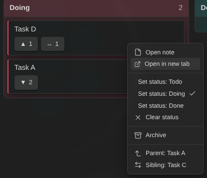
- Right-click (or long-press on touch) a card for a menu: open the note (or in a new tab), send it to the top or bottom of its column, set its status, clear the status, set an enum property (see below), schedule it, set a deadline, archive the note, open or edit a related note.
- Set a property in one click. For any property with known allowed values, the card menu shows a **Set
** submenu (e.g. **Set priority → 10 - Top**) with the current value checked and a **Clear** option, just like **Set status**, but for `priority`, `urgency`, `effort`, and any other enum. Allowed values are detected from the **Obsidian Starter Kit** when present, or defined per note type under **Configure board → Enums** (see below). The note is written and the board updates immediately.
Remembered view state
Each Kanban view remembers how you left it, per view, across reloads and reopening Obsidian:
- Board vs Calendar vs Timeline mode, and the calendar range (Week/Month/Quarter/Year), active tab, panel collapsed state, and the Scheduled/Deadlines legend toggles.
- The timeline range (Week/Month/Quarter/Year), its panel collapsed state, and its hidden types.
- Collapsed swimlanes and collapsed columns.
- Compact cards (titles only) on or off.
- The toolbar filter query.
A few bits are deliberately not remembered, and reset every time you reopen the view: the calendar/timeline anchor (both jump back to today) and the calendar’s focused day zoom (cleared).
View options (Configure view)
Open the view’s options (the Bases Configure view panel) to tune this board without changing your notes. They’re grouped:
Columns
- Status property: choose which property drives the columns (overrides auto-detection).
- Statuses (columns): the list of status values to show as columns, in order (one per entry). This is the per-view column definition.
- Manual order property: choose where card order is stored.
- Card sort: how cards are ordered inside each column. Manual order (default, drag to arrange), Name (A–Z), or By property. Card sort property picks the property for the last option, and Card sort direction sets ascending or descending. A non-manual sort disables in-column drag and keyboard reorder (missing values sort last). The sort property can be a base formula (e.g. a
priority_scoreyou define in the base’s formulas): pick aformula.…(orfile.…) entry to sort by a computed value. Same for Grouping property below. - Show empty columns: keep columns with no cards visible (useful when columns come from a note type’s defined statuses).
- Unmapped column position: show the Unmapped column first (left, the default) or last (right). It still only appears when something is unmapped.
Swimlanes
- Grouping: override lane grouping for this view. Use note type default (which auto-groups by note type when the board mixes types), None, By note type, or By property. (The per-type default is set in Settings.)
- Grouping property: when grouping By property, the property whose values become lanes. This can also be a base formula (
formula.…) orfile.…column. Grouping by a computed column is read-only, so cross-lane drag is disabled for those lanes (there’s no property to write back).
Filters
- Blocked cards: show all cards, only blocked ones, or hide blocked ones.
Calendar
- Default range: Week, Month, Quarter, or Year.
- Scheduling panel sort / sort property: order the panel’s tab cards (narrowing is done with the toolbar filter box).
(Calendar mode itself is toggled by the in-view Board / Calendar switch. The scheduled and due date property names are set globally in plugin settings.)
Timeline
- Default range: Week, Month, Quarter, or Year. (The start/estimate/milestones property names are global plugin settings, not view options.)
Note type configuration (colors, enums, relationships, archiving)
A note type’s shared config lives centrally in Settings → Community plugins → Kanban Action Planner → Note types. Pick a type and click Configure to open a dialog with sections on the left (Colors, Enums, WIP limits, Swimlanes, Relationships, Archiving) that apply to every board showing that type. The gear in the board’s top-right is a shortcut that jumps straight to these settings. (What each card shows is set per view via the Bases Properties selection, see Card content above.)
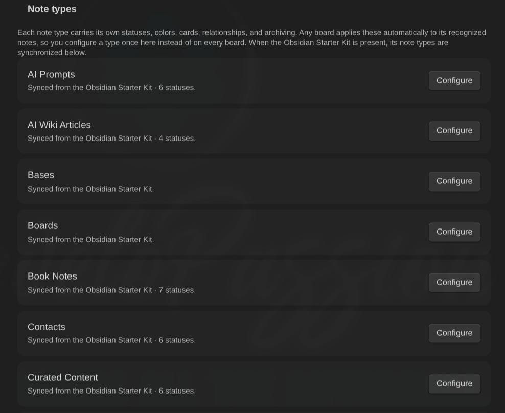
Define your own note types, no Starter Kit needed. Click Add note type to create a local type. Its Note type section lets you name it and add recognition rules: a note is recognized as this type when any rule matches, by tag (including nested tags, so type matches type/task), by folder (the note is in that folder or a subfolder), or by a regex on the note path. Recognized notes then pick up that type’s colors, relationships, and archiving, and can drive By note type swimlanes, all without the Obsidian Starter Kit. Delete a local type with the trash icon (your notes are untouched). When the Starter Kit is installed, its recognition is tried first and your local rules act as a fallback.
In the WIP limits section, set a soft per-column limit for any status (leave blank for no limit). The column header then shows count / limit, and a column over its limit turns its count red, a gentle nudge toward classic Kanban flow. Limits are a warning only. They never block moving a card into a full column.
In the Colors section:
- Toggle Auto-assign colors to give each status a palette color automatically.
- Per status, pick a palette color, choose Custom… and use the color picker, or pick Auto to reset.
Card accents and column shades follow the status color and adapt to your light or dark theme.
In the Enums section, define the allowed values for any property (e.g. priority, urgency, effort), one per line, in order. These power the card menu’s **Set
Card content
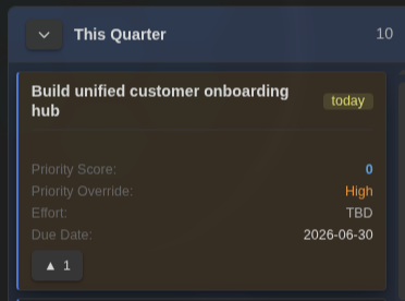
Cards show the properties you’ve added to the view, the same Properties selection you set with the Bases toolbar (the Properties menu / “Configure view”). Each property in that list (other than the note name, which is the card heading) renders as a labelled field on the card, in the order you arranged them. This works for ordinary note properties and base formulas (a formula.… column like a priority_score) and file columns (file.…), so a computed value shows on the card with no extra setup. The field label is the property’s display name from the base. Empty or unset values are skipped. Add, remove, or reorder card fields the same way you would for any Bases view: change the view’s properties and every card updates.
Card title. By default the card heading is the note name. If your filenames aren’t meant to be read (date-prefixed slugs like 2026-07-07-technical-meeting, ID-based names), pick a Title property in the view options (Configure view → Cards → Title property) — for example a title or name property — and the card heading shows that property’s value instead. Base formulas work too. A card whose note doesn’t have the property (or has it empty) falls back to the note name, so cards never go blank. The chosen property is not repeated as a body field, and clicking the card still opens the underlying note. The title applies everywhere the card appears: the board, the calendar chips and scheduling panel, triage, search, and name sorting.
Field rendering is tuned for scanning the whole board at a glance:
- Enum values are color-coded by where they rank, a warm (red/orange) signal for the top or most-urgent values down to cool (blue/muted) for the bottom ones, so the board reads at a glance. Ranking uses the numeric
NN -prefix, so it doesn’t matter what order the allowed values come in; a99 - …“not decided” value lands coolest. Note properties rank against their allowed values, and base-formula values rank against the distinct values present on the board. A value with no rankable scale stays neutral. - The
NN -sort prefix is stripped from display:30 - Highshows as High,99 - ⏰ No Targetas ⏰ No Target. (Dates like2026-01-15are never touched.) - A numeric formula value (e.g. a
priority_score) is the standout score. - A percentage field (display name contains
%or “progress”, numeric value) renders as a small progress bar with a%caption. - Labels stay legible (different properties can share a value set, e.g. priority vs priority override both reading
High), so the label still tells them apart.
Choose the chip style in Settings → Community plugins → Kanban Action Planner → Card chip style (applies to every board):
- Minimal (default): no fills, a faint label plus a heat-colored value, laid out as a clean vertical stat list. The calmest, most consistent look.
- Tinted: each value is a flat color-filled pill, so the board reads like a heatmap.
- Rail: uniform neutral pills, each with a colored left edge for the heat signal.
A note’s due date is always shown in red when set, regardless of which properties you’ve added.
Overdue emphasis. Cards with a past due date get a red background wash so overdue work pops at a glance, and cards due today get a softer amber wash. This uses the card background, so it stays distinct from a blocked card’s red left edge: a card that is both blocked and overdue shows both signals. The state updates whenever the board refreshes (e.g. as the date rolls over).
Due countdown. Turn on Show due countdown in a board’s view options (Configure view → Cards) to add a compact badge that says how soon a card is due: today, in 3d, 2d overdue, in 2w, in 3mo (the unit scales automatically, days, then weeks, then months). The badge is color-coded by urgency: red overdue, amber today, orange soon, and a muted tone further out. The toggle is per board (off by default), reusing the same due date the red emphasis uses.
Two global settings (Settings → Community plugins → Kanban Action Planner) tune it for every board:
- Due countdown position: where the badge sits. Title row (default) a right-aligned pill on the title, Field chip among the bottom chips, Top-right corner a pill in the card corner, or Footer row a strip at the bottom.
- Due “soon” threshold (days): within how many days the badge turns warm (orange). Default 7. This changes the color, not whether the badge shows.
The dialog also has Swimlanes (group the board into lanes) and Archiving (move finished cards into a folder) sections, see Swimlanes and Archiving above.
Obsidian Starter Kit integration
The Obsidian Starter Kit is completely optional. The plugin works fully without it, and the two simply combine well. If the Starter Kit plugin is installed, the board recognizes a note’s type and uses that type’s status property and allowed values to build its columns, including empty columns in the type’s defined order. The Starter Kit stays the source of truth for that, and your color choices are saved locally and survive the Starter Kit being disabled. Without the Starter Kit, columns come from the status values found in your notes.
Command palette
A few commands act on the currently focused Kanban view (they do nothing when another view is active, and each can be given a hotkey in Settings → Hotkeys):
- Toggle board / calendar mode
- Toggle timeline mode
- Toggle triage mode / Configure triage
- Focus filter: jump to the filter box
- Clear filter
- Go to next swimlane / Go to previous swimlane
Where it lives
Most of the experience is inside the Bases Kanban view itself. The plugin’s settings tab holds the global default property names used when a note or board doesn’t override them.